Hypothesis
Creating standard templates and bringing the ability to produce interactive elements using the internal publishing tool (Spark) would greatly reduce the time and resources needed to produce these stories, which means we can learn quickly and innovate faster. It will also solve the problem of articles gifting and syndication as well as eliminate SEO drawbacks.
What is it
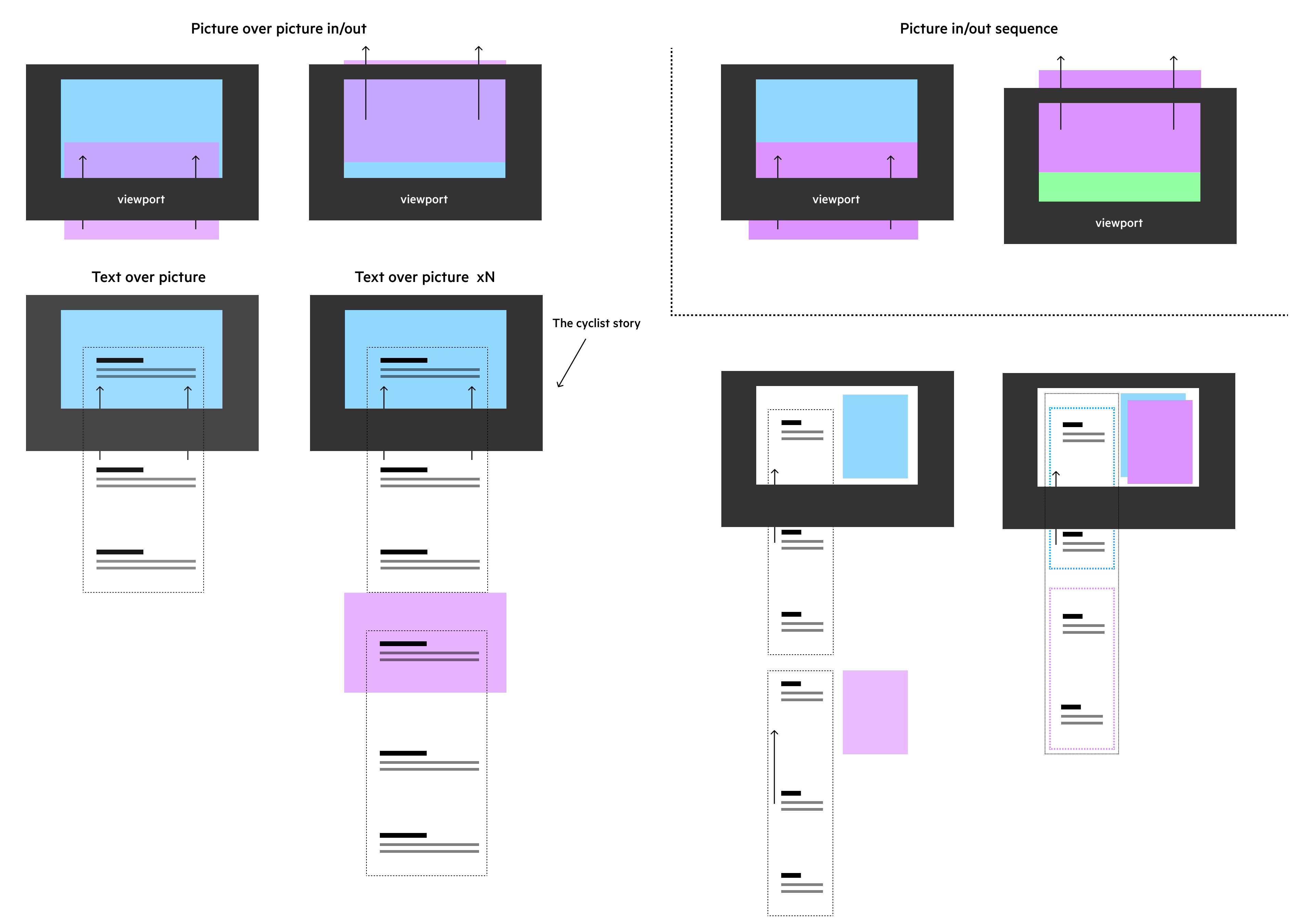
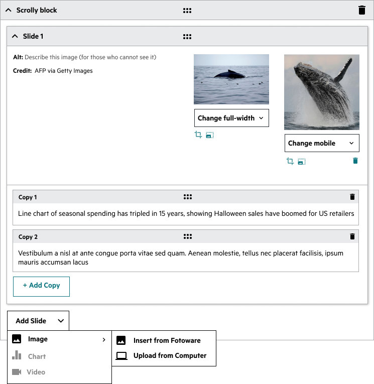
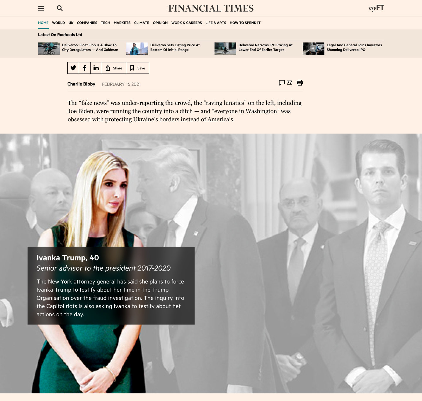
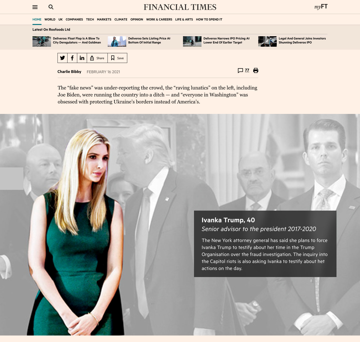
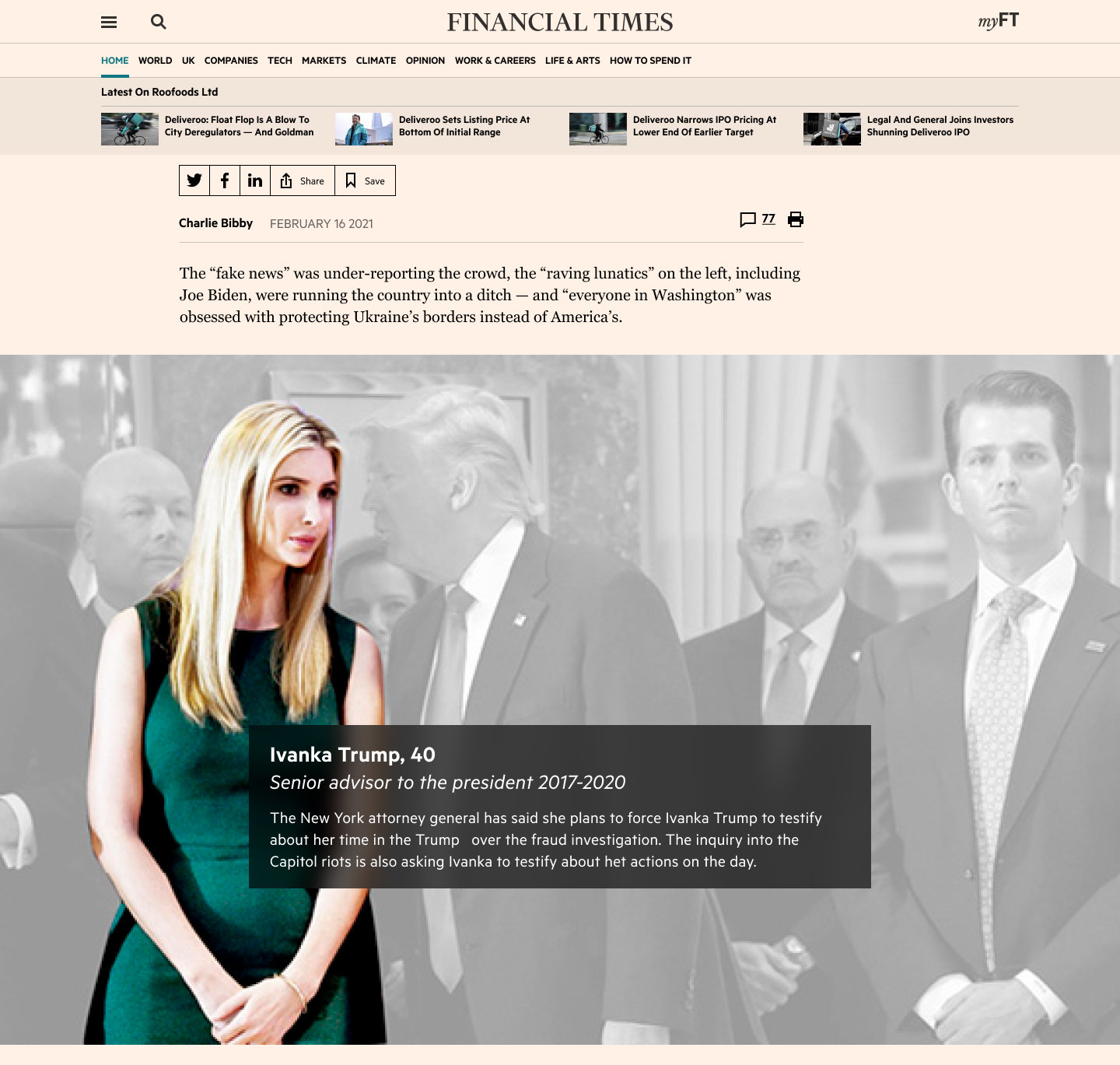
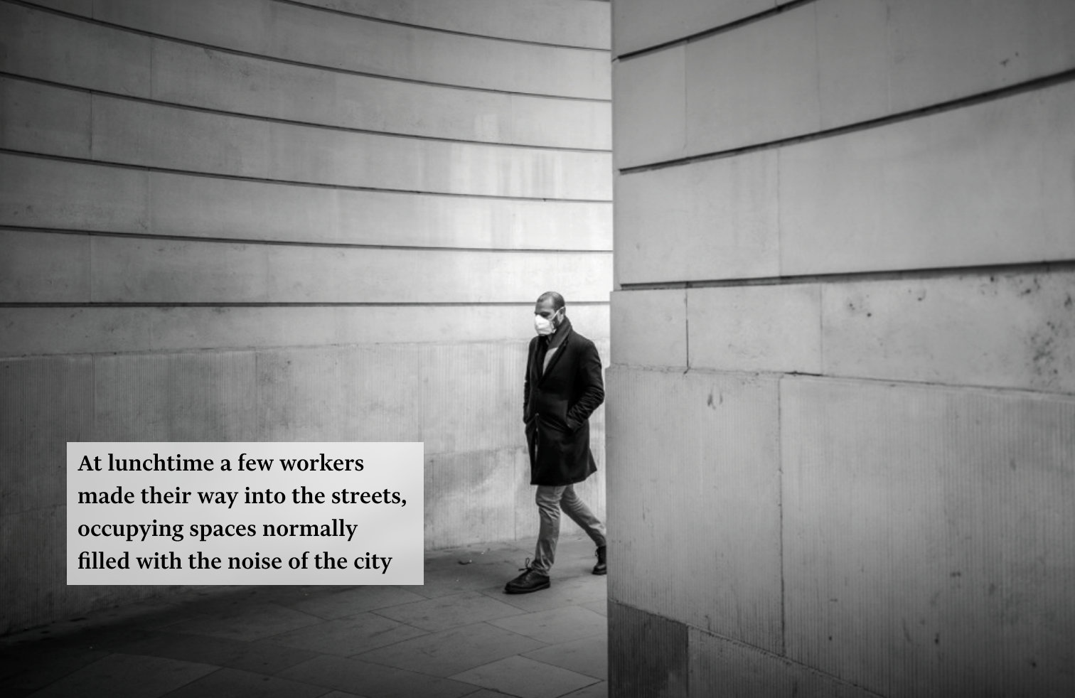
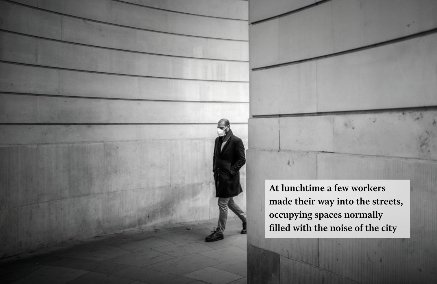
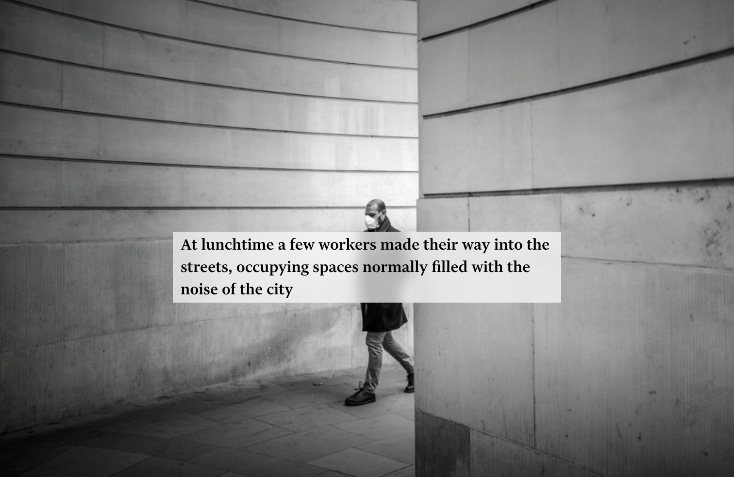
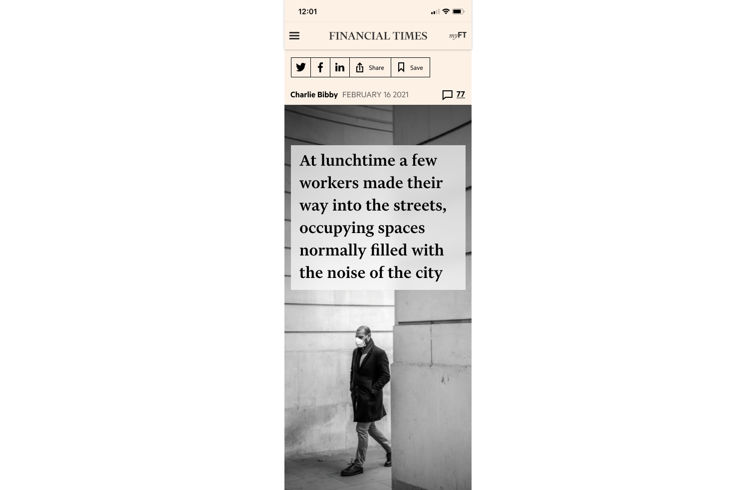
Scrollytelling is a format that stitches together full-width images and text to tell a story that unfolds as the reader scrolls. It is used to create an immersive experience for readers, to convey a mood or an atmosphere, or to provide explanations for complex topics in a visual manner.
Phase 1: MVP. How we started
Together with the Product Manager we started by running a series of conversations with the journalists and editors in the Newsroom. We found that the appetite for that for the scrollytelling feature is substantial for the team to invest time and effort into it. I held a workshop with the team including colleagues from different disciplines, also inviting two major stakeholders: Head of Newsroom Operations and Visual Stories Editor to get their thoughts and ideas.
My Role
The aim was to design both:
- How readers will see it on FT.com
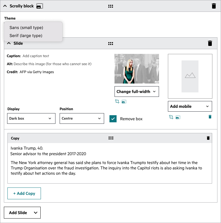
- The interface for the internal publishing tool Spark.
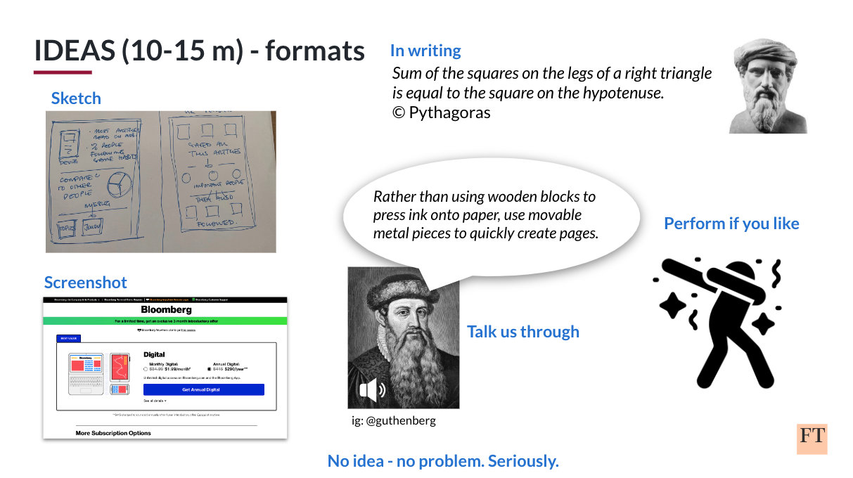
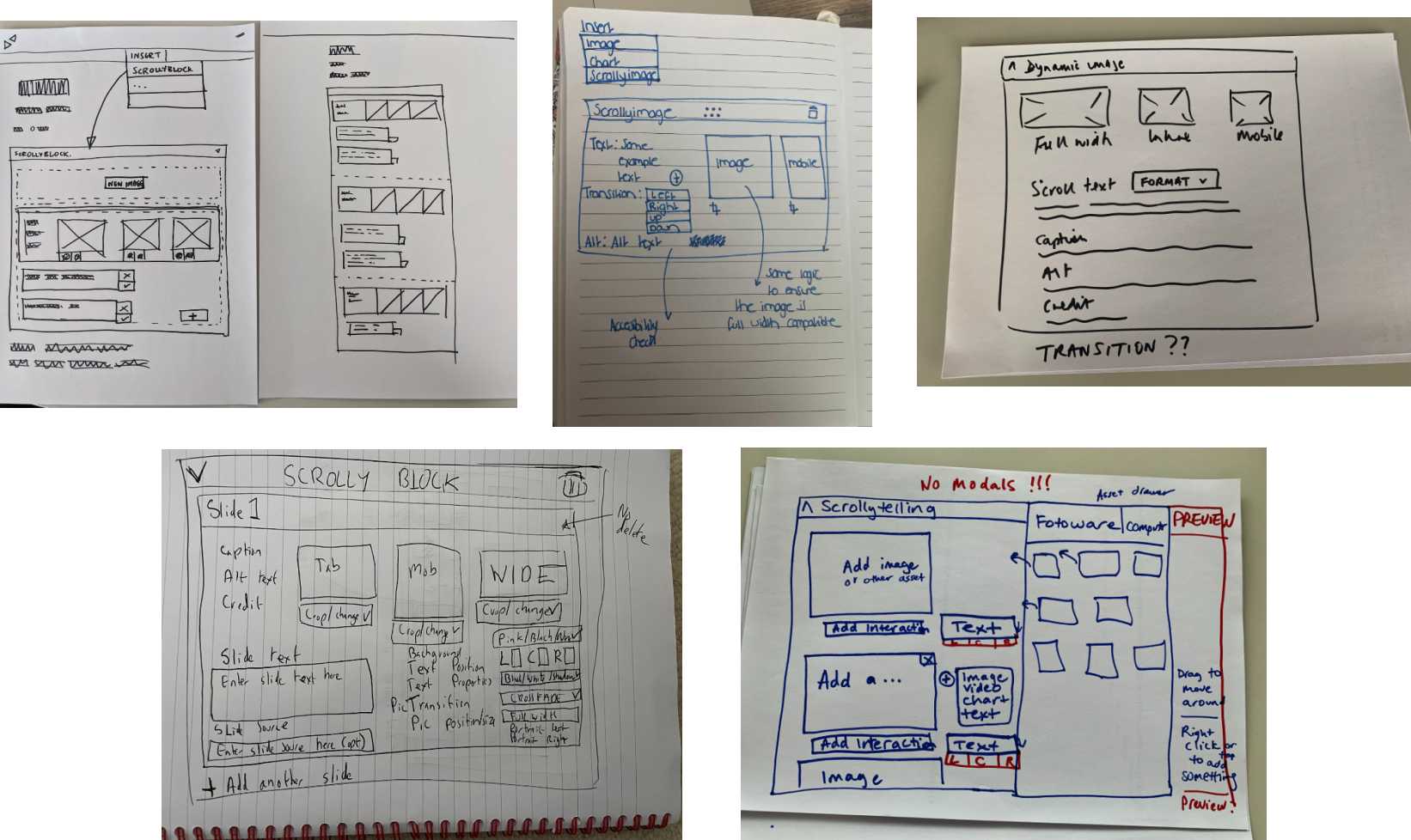
While thinking of the way an article would be displayed to a reader, I started basic sketching and it triggered a number of functionality-defining questions.
For example:
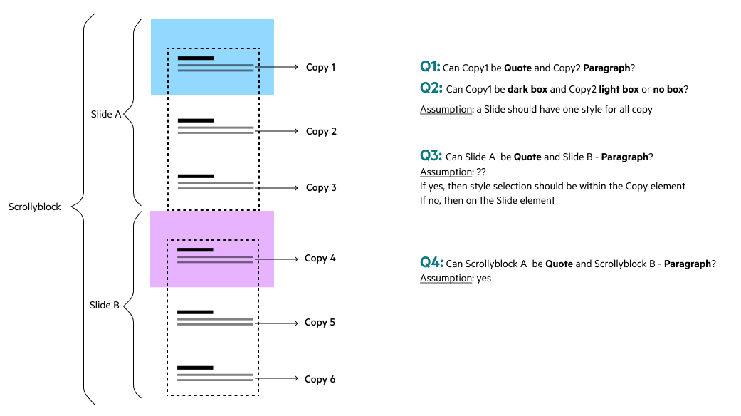
- Can two copy instances on the same slide be a Paragraph and a Quote?
- Can two copy instances on the same slide be of a different style?
- Is the copy style defined on the slide or scrolly block level?
To clarify questions above, I kept meeting with the two main stakeholders frequently to make sure that we’re progressing in the right direction.
When I got a “go” on the main questions, I coded an html prototype to be able to demonstrate the scrolly would work in real digital life. In parallel I held a few meetings with the devs. I found it beneficial showing early prototype, so I could get perspectives from other disciplines and change things quickly if needed.
At the same time I was working on how the interface will look for the Editorial team. People who would be the end users of the tool, were constantly giving me feedback whether it made sense, what would be the best copy for controls and labels.
Phase 1: Outcomes
MVP used images and text only. Our aim was to start small with proven story formats and eventually expand beyond scrollytelling into more ambitious article iterations.
Although at the moment of releasing the first version of Scrollytelling, there was only one text style available. Unfortunately it turned out that it’s not enough for the journalists to match the way they want to tell the stories.
Challenges
Although the project got a lot of attention, and was widely celebrated across the company, it wasn’t exactly smooth sailing.
 1
1
First was that the Editorial work practices are very different to Product and Technology’s ones. Our colleagues in the Newsroom aren’t used to an agile work style. They would expect to get the whole functionality at once (and quickly!) rather than frequent small improvements (and slowly). It took time and emotional energy to get across the way we work in Technology and I think after this project there is way more understanding between the two teams.
2
I had two senior and very opinionated stakeholders on this project. Sometimes, after showing prototypes and getting a “go” with the Visual Stories Editor there came a pile of changes from the Head of Newsroom Operations. After a few rounds I realised that the only way forward is locking them in one room, and not unlocking until an agreement is reached.
3
Unfortunately Accessibility hasn’t been seen as paramount by the Newsroom. And there was no clear ownership of who is making final call decisions on FT.com designs, which caused some confusion and misunderstanding.
Phase 2: Themes
After seeing that the number of articles published is close to zero, we already knew what we’re going to work on next. We worked closely with the Editorial Design team to understand what sort of flexibility they would expect. They had strong aspirations for the full font-size, colour and position control, although we couldn’t have provided functionality for that. Instead, we offered a middle ground where there’s an option for Sans or Serif, dark or light background and positioning right, left or centre.
After agreeing how articles will look for our readers, I worked on Spark interfaces and handed them over to Spark devs.
It was now possible for journalists to select from a menu of fonts, text styling and position, which made the component flexible, adaptable, and usable.

Outcomes
Eventually we released a more flexible framework for experienced editors to customise layout according to story needs.
Now FT Newsroom has easily configurable scrollyblocks with design versatility across the pipeline (from Spark -> FT.com) and is able to produce the required visual depth of stories on a timescale that matches the news cycle.
There’s already a number of articles published using the scrollytelling feature and the number is growing.
Here’s a few examples:
How did Donald Trump’s picks perform in the 2022 midterm elections?
How furniture design is tackling the plastics paradox
Curator’s pick: Marsden Hartley’s ‘Painting, Number 5’ at New York’s Whitney
Goals and metrics
Our approach is to release and learn. As we iterate over the design and features of this format in the coming weeks, we hypothesise that they will encourage readers to read these stories longer and deeper than they do on our standard text-based formats. Our target is to exceed 50% quality reads (average across the FT is 40%).
A bit of philosophy & personal insights
Despite the project having its ups and downs and at times felt like a bumpy ride, I often feel proud of it everytime I see a new article released with this feature.