
Make it easier to cancel subscription online. I totally get that you want to improve customer retention by making it nigh on impossible to leave but that only makes customers who leave NEVER want to come back to you again.
Hahahaha? Seriously? OK. Stop acting like it’s 1972 and as if making people email their personal information in plain text to you to cancel their subscription is normal. Take example from literally any other publication or site. Never coming back, personally. Good day to you and your $61?!? monthly subscription. Never coming back and never, ever referring anyone to FT.com, for sure.
The customer service is excellent. But there is plenty which you can improve. Try by making it easier to cancel subscriptions, I am not subscribing in the future due to this.
Not doing this really cheapens the FT brand. I'd expect this type of behaviour from The Daily Sport.
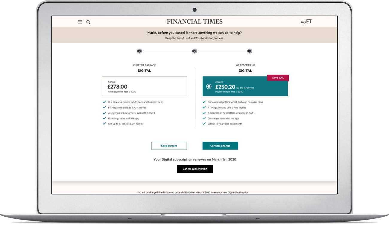
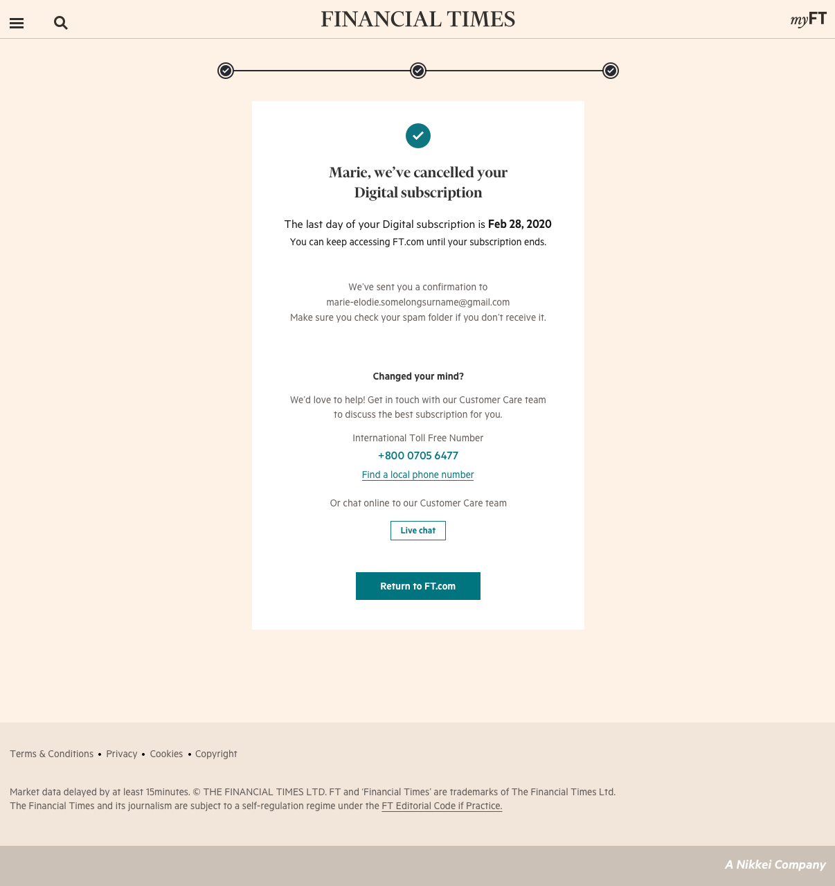
We started working on the online cancellation, which we call “Save me” Journey.
We thought that we could save our readers by offering them a better deal and stop the readers from cancelling in a customer-friendly manner. Another goal is a reduction in cancellation cases into Customer Care e.g. we want to reduce the number of calls and chats.
The good news
None of our direct competitors was doing online cancellation at that moment and if we manage to do it right, we believe it will be a great success.
First iteration of user testing
To get some direction, we have run several short one-on-one sessions with users and the questions we’ve been asking were:
- If a user decides to cancel anyway, is the proposed journey clear?
- Can we keep the users from stopping the subscription by offering them a better deal and save them?
We assumed that if we propose the right offer at the right time, we’d be able to keep our users and decrease the number of cancellations as well as improve the FT brand credibility.
Some of the key findings were:
- The cancellation journey is clear with 5/6 users completing this successfully.
- 5/6 users commented that the offers displayed were suitable for users where cost is an issue.
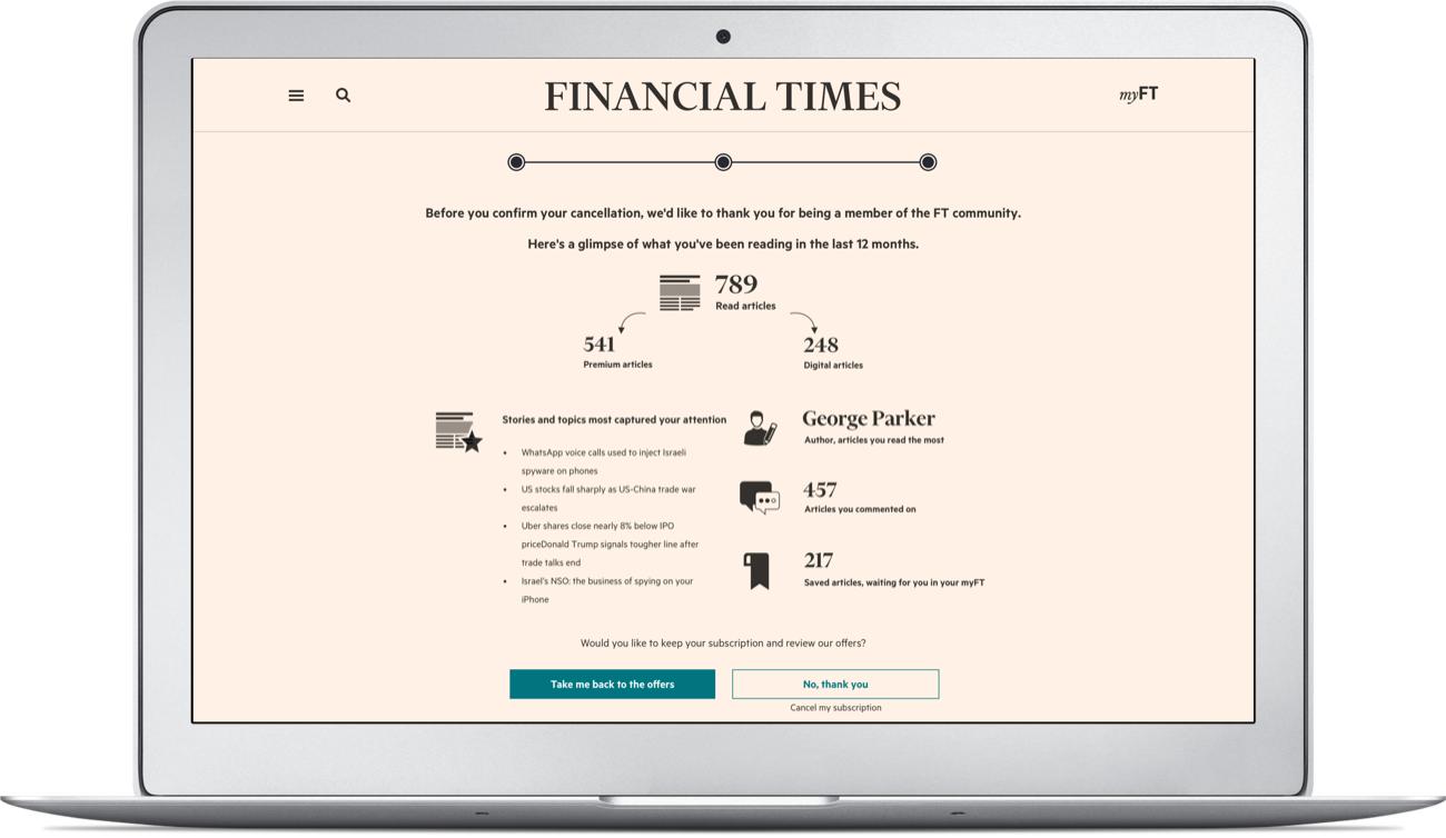
- The subscriber usage stats page was viewed as interesting to some users as a way to see how they had used their subscription.
However, some users noted that this screen would add very little value in deterring them from cancelling. A stronger offer- such as two months of free access- was suggested as an alternative motivation in this instance.
In the meantime: Secondary research
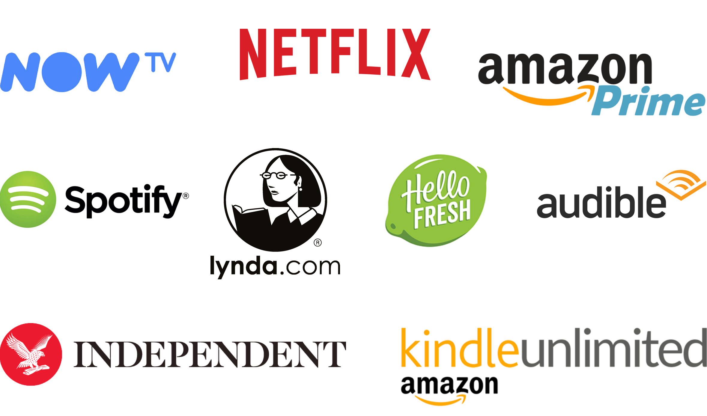
Alongside I did a non-direct Competitor review where I looked at 9 D2C digital subscriptions in mostly entertainment and education sector.
I was looking at the aspects like:
- Sector
- Price per month
- Cancel Subscription Location
- Wording
- Number of clicks from homepage to cancel confirmation
- Offers made yes/no
- What was the offer
- Other techniques used
- Order of the techniques applied
- Asking for the reason to leave
However, one thing I focused on the most was techniques used and their order. I found 3 main elements used in any cancellation journey:
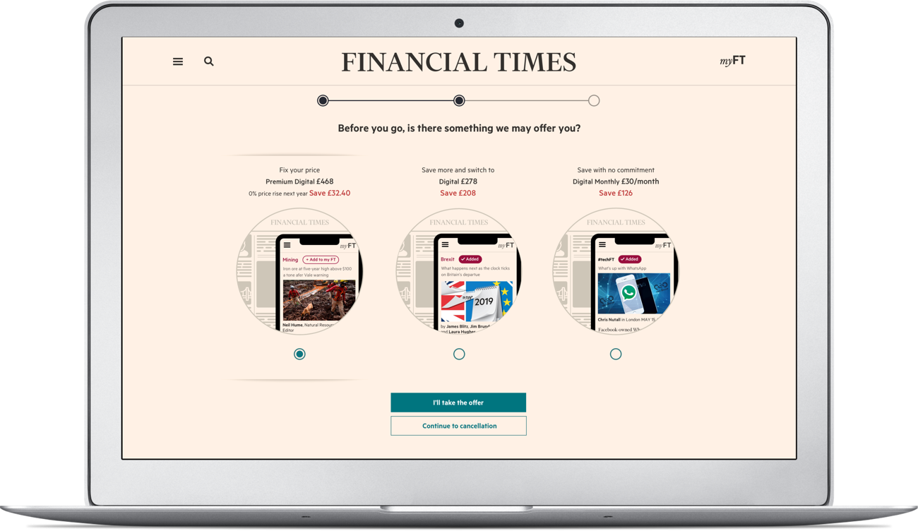
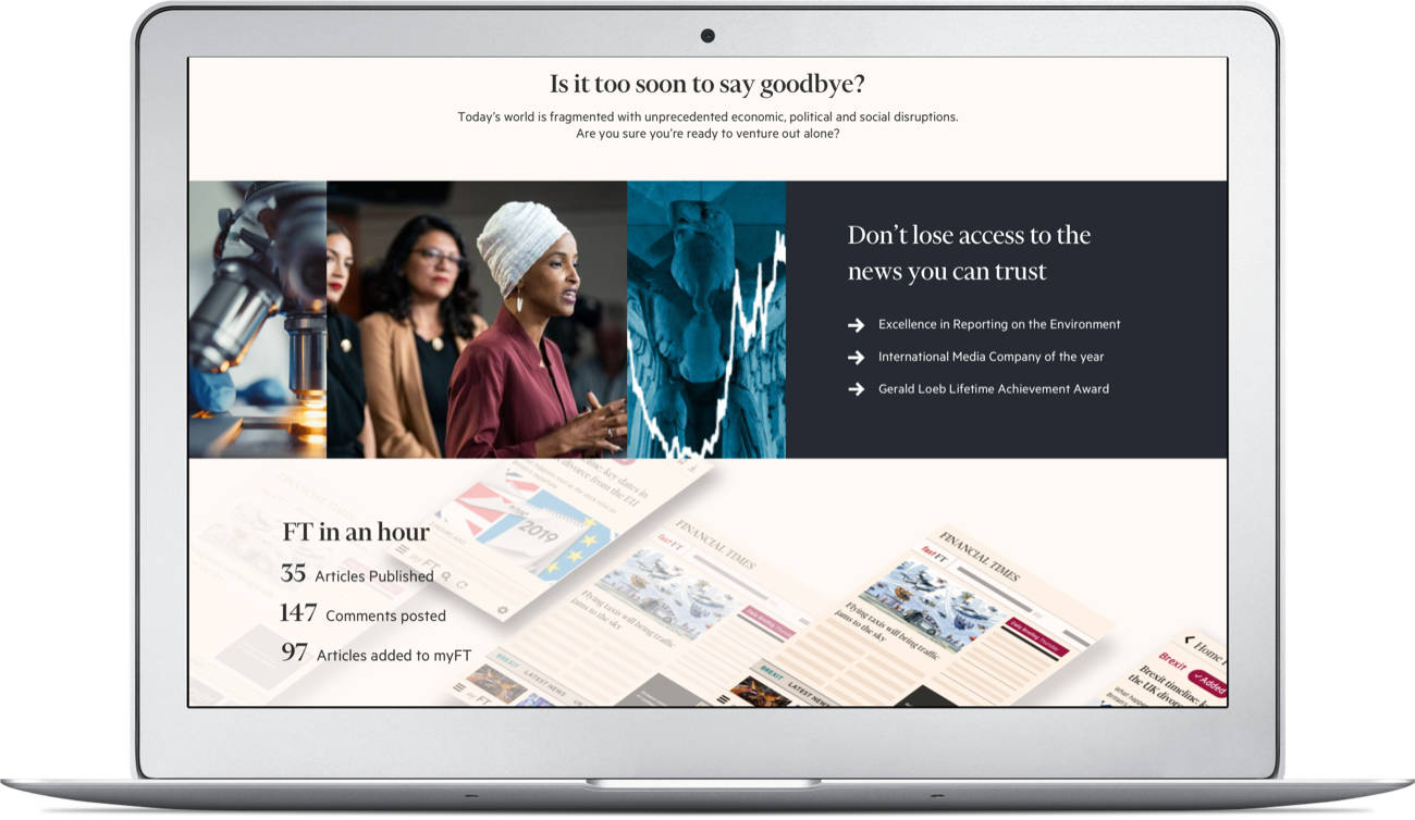
- FOMO page –
A page where it’s stated what you’re going to lose and how painful it’s going to be. - Offer page –
A page with one or few offers displayed trying to stop a user from cancelling and save them. -
Survey/Asking for the reasons to leave –
A page containing a survey or having a list of presumed reasons to leave. Apart from nowTV it was optional for the rest of brands looked.
I was lucky enough to find 2-years old screenshots from some of the brands' cancellation journey and had a particularly close look at those brands who I thought are forward-thinkers based on their journey updating frequency.
I found a common pattern there:
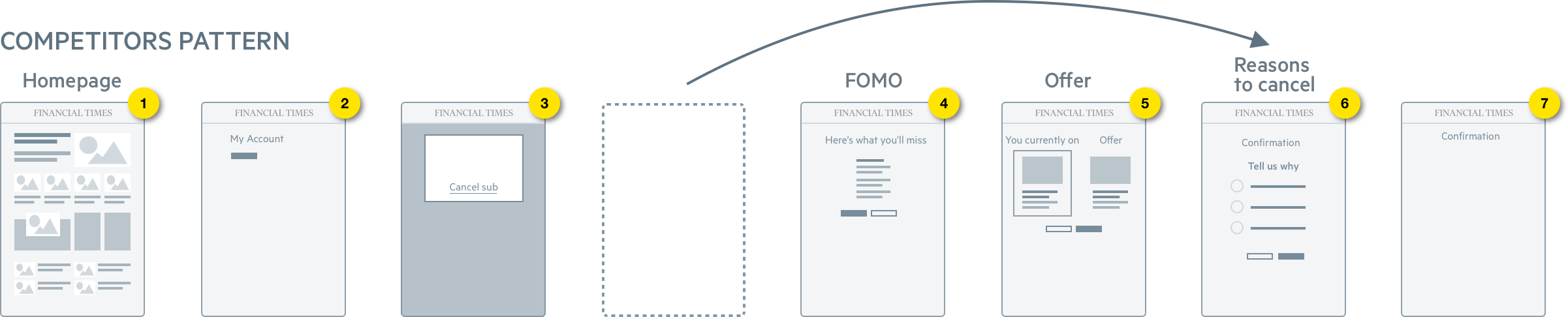
Which is FOMO page → Offer → Optional Survey
We decided to test this scenario and see if it works or fails.

Based on these insights from User research and Competitors review we got we decided on our next steps:
- Try to get Users who have recently cancelled their subscription
- Re-test the ‘Save me Journey’ with a focus on the FOMO
Crazy-8 workshop
I held a short workshop gathering people from different disciplines and collecting the wildest ideas what we can do to stop someone from cancelling or how to invite them back once they’ve done so. I had a lot of fun and tones all sorts of ideas like moving Cancel button on hover, but my favourite was: “Making users watching FT getting shredded for 5 seconds”.
Second iteration of user interviews
I used the insights gathered from first iteration user testing and secondary research and looped them into the Second User testing to understand whether we’re going in the right direction or it’s better to stop and try other approaches.
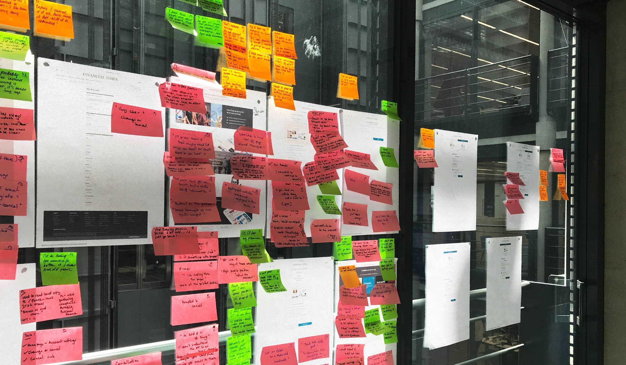
Combined research: Key takeaways
After we’ve compiled the information from two user research sessions and the secondary research, we came to the following conclusions:
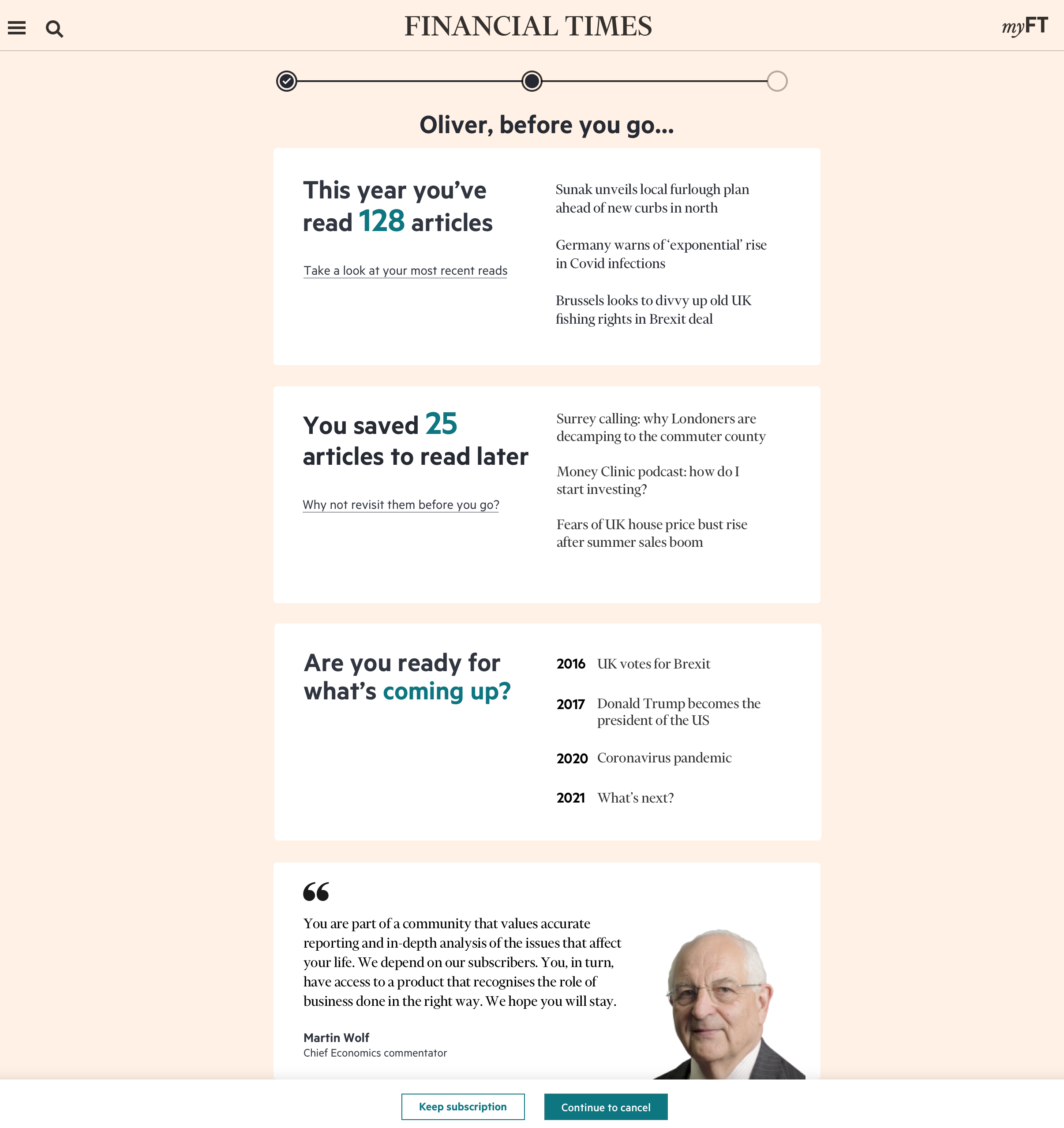
- More personalised info on FOMO page focused on what they would lose by cancelling and benefits of the FT.
- Clean and clear design focused on ‘service elements’.
- Focus on the transition pages: make this very clear, avoid any uncertainty on the difference between the two offers displayed.
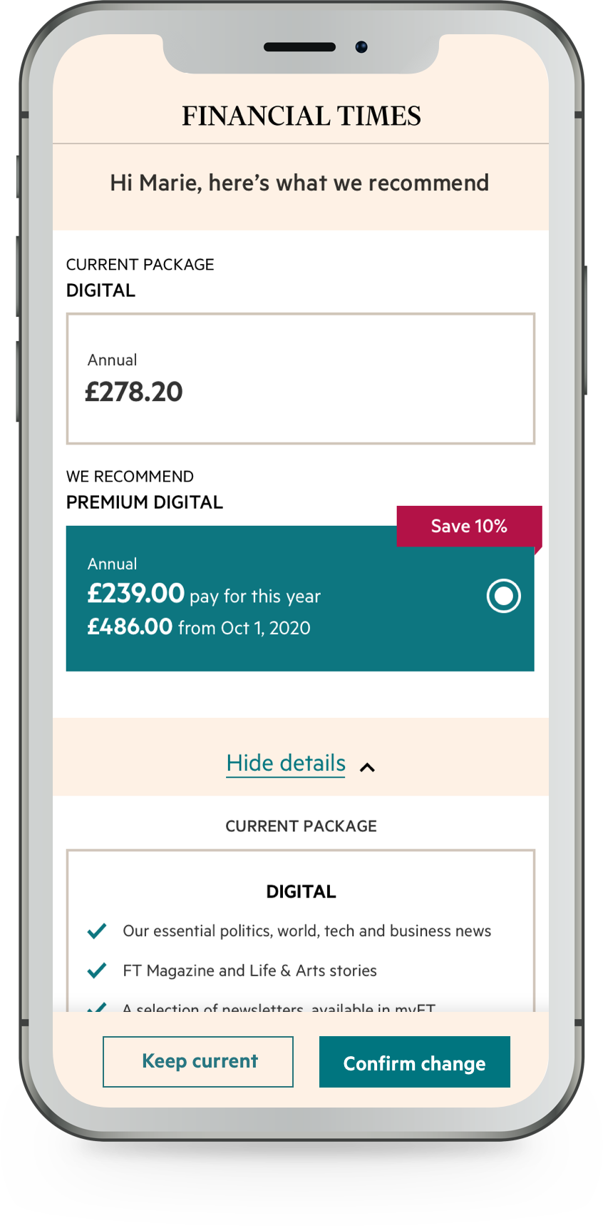
While testing the FOMO page, we found that ‘loss aversion’ and the benefits/rewards they’ll get from keeping their subscription is one of the key drivers. One user suggested we highlight the columnists they’ll lose access to and what they’re writing about as a way to remind users of their interests, as well as the loss of access to their portfolio tool.
Therefore we started thinking about how can we use personalisation here and work with the tailored experience team using a lean approach of reusing what we already have for that.
A smoke test
In parallel, we started the smoke test which was adding two fake buttons ‘save’ and ‘cancel’ subscription on “manage my account” page and test how many and what kinds of subscribers are clicking them.
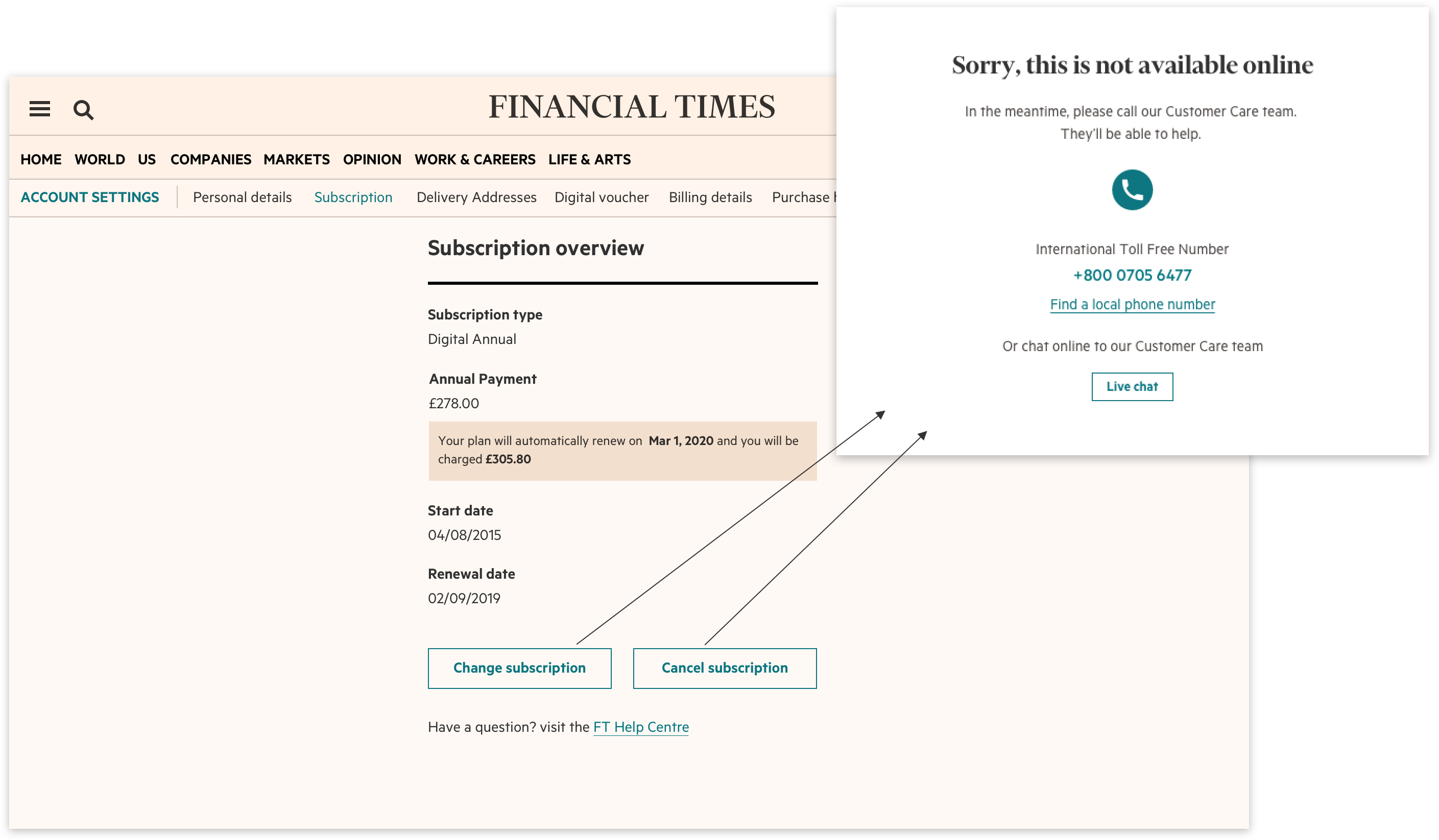
The team was surprised to find, that not everyone was clicking the “Cancel” button, and the ratio was 43%/57% as to “change” versus “cancel”.
We noticed email cancellation volume got down which provided more opportunity to save customers.
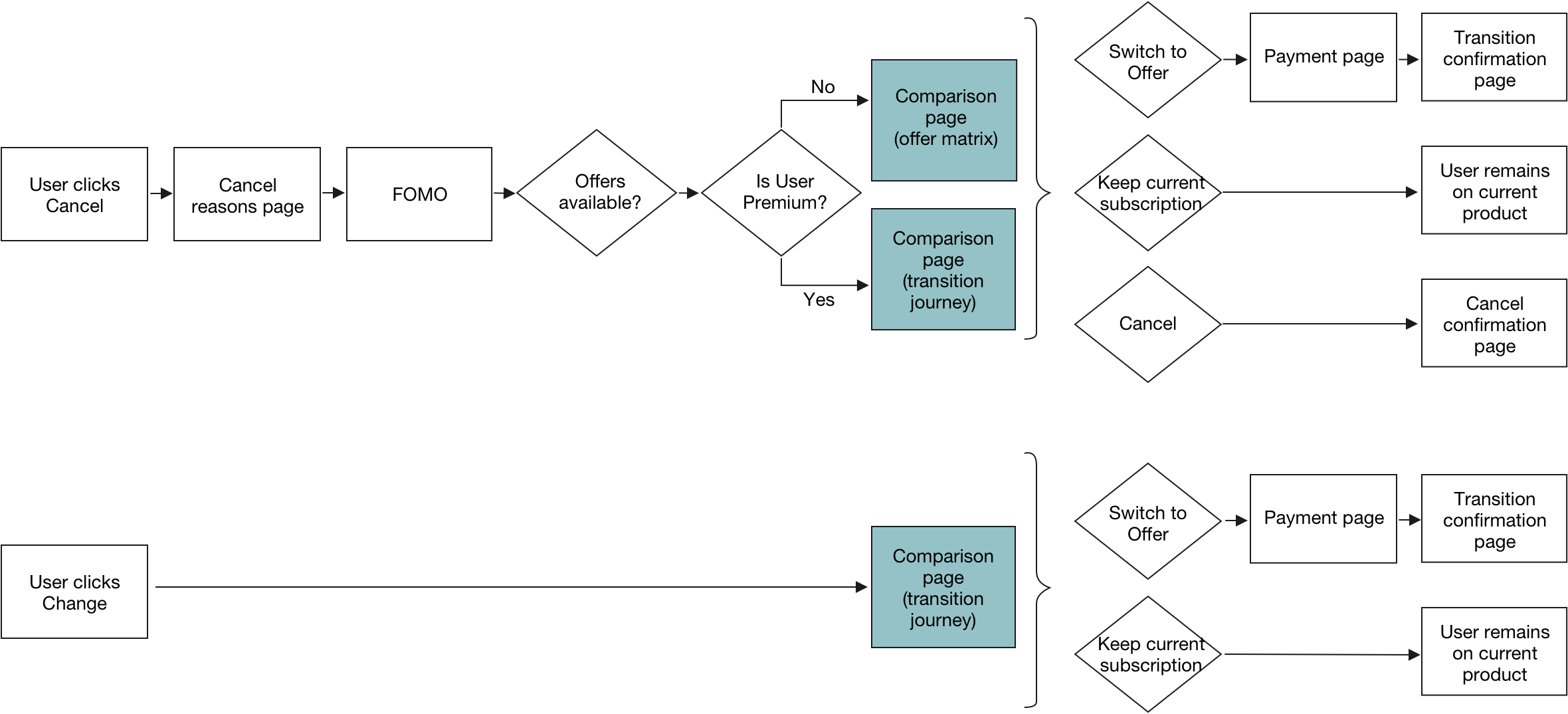
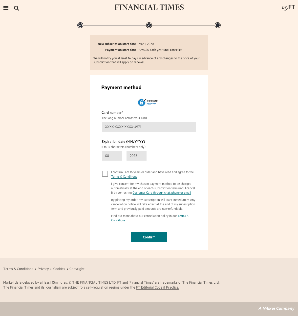
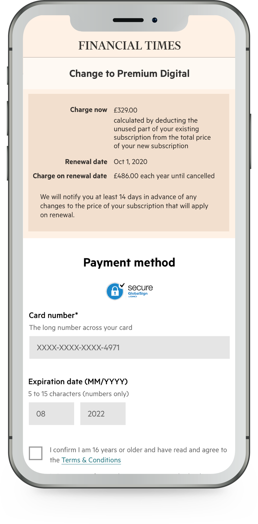
Product Transitions
Transitions were not the focus of this initiative but a natural by-product of building out the cancellation journey. We couldn’t enable cancellation without a transition. Therefore we built them first.
| From Standard Annual | to Premium Annual | ONLINE TRANSITION | Immediate transition |
|---|---|---|---|
| to Premium Monthly | Direct to Customer Care | Refund required; direct to CC | |
| to Standard Monthly | Direct to Customer Care | Not MVP until verified customer need |
| From Standard Monthly | to Premium Monthly | ONLINE TRANSITION | Immediate transition |
|---|---|---|---|
| to Premium Annual | ONLINE TRANSITION | Immediate transition | |
| to Standard Annual | Direct to Customer Care | Not MVP until verified customer need |
| From Premium Annual | to Standard Annual | ONLINE TRANSITION | End of term |
|---|---|---|---|
| to Standard Monthly | ONLINE TRANSITION | End of term | |
| to Premium Monthly | Direct to Customer Care | Not MVP until verified customer need |
| From Premium Monthly | to Standard Monthly | ONLINE TRANSITION | End of term |
|---|---|---|---|
| to Standard Annual | ONLINE TRANSITION | End of term | |
| to Premium Annual | Direct to Customer Care | Not MVP until verified customer need |
The template, used for Product comparison page has been designed in mind to be able to reuse it in the future for the “Save me” journey, so, we could use the same page, but depending on where from did the user come, display the relevant numbers on it.
I worked closely with the business analyst and Customer Care to understand the logic of offers business wants to inject and User Journey.
Designs handover
After I finished crafting designs, they got attached to the relevant dev ticket and landed in the backlog. I prepare both desktop and mobile view files.

There’s no such thing as “handover-done-I-can-forget-about-it”. One the development started, I kept assisting engineers all the way whenever there were slight inconsistencies, or we needed to make it work with the existing limitations of our design system.
My main challenges
 1
1
It’s not a secret that development is a costly process. I was tasked to come up with a pattern which would work in all scenarios: Trial cancellation, product transitions and normal subscription cancellations, where transition journey was naturally part of cancellation. However, when you delve deep into all the nuances of every journey, you realise it’s extremely hard or sometimes impossible to come up with copy, ctas and UI of type “one-size-fits-all”.
2
People cancel their subscriptions for various reasons. Some lose jobs or need to suspend for a longer time than the publisher allows. Making it difficult to cancel closes the door for many people to come back.
I personally believe that if a provider makes online cancellation easy, it will make subscribers way more likely to come back.
But it’s impossible to measure emotions as well as people’s word of mouth. Which makes it very hard to communicate to the business “your belief”, as business prefers numbers.
A bit of philosophy & personal insights
No matter how many artboard variations you generate and how (to-a-certain-extent) many hours you spend testing, gathering insights and negotiating with the Product manager. If at the end you’re getting uncomplex and neat solution consisting of only a few screens, you are probably going in a good direction.